Histograms
At its most basic, a histogram a graphical representation of the distribution of tones in an image. Histograms can be used to assess exposure either before shooting (in Live View on a DSLR), after shooting in playback or later in post-production. A histogram, once you know how to read it, is a far more accurate way of deciding whether a photo’s exposure is correct than using the brightness of the image on the LCD as a guide.
So, how do you read a histogram? The first thing to note is that the extreme left edge of the histogram shows the proportion of pixels in the image that are totally black. The higher the vertical column, the greater the number there are. As you move right across the histogram shows you the number of pixels that are progressively lighter than black. A peak roughly in the middle would show you the proportion of pixels that are equivalent to a mid-grey in the photo. (If you were to take a picture purely of grass or rock, which has an average mid-grey reflectivity, you would see an almost perfect bell distribution curve.) At the extreme right edge you would see the number of pixels that are white.
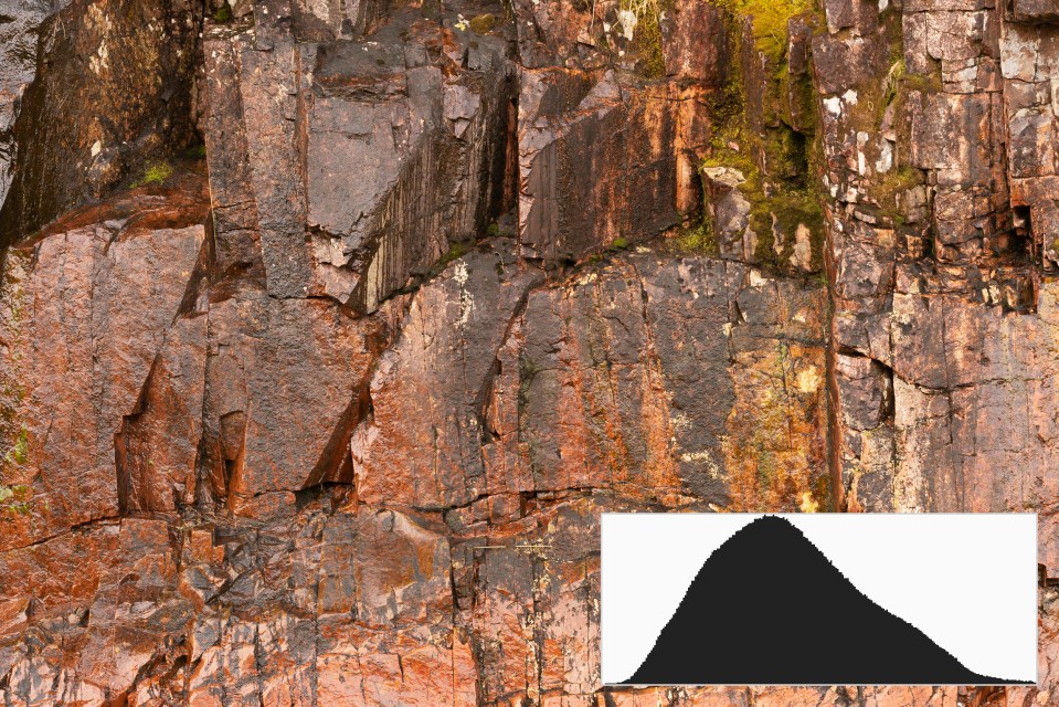
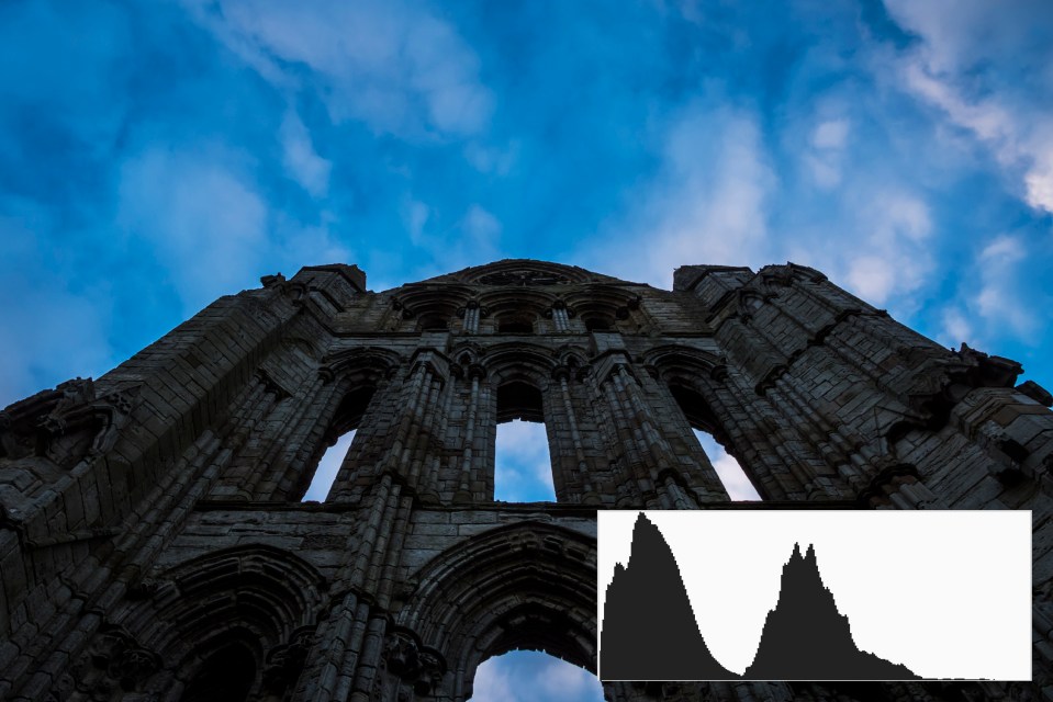
A histogram often has an undulating shape. This is because most scenes have a wide range of different tones and are rarely just one overall level of brightness. (With the exception of subjects such as grass mentioned, but who shoots photos that are as bland as that?) If a histogram has a very serrated look, don’t worry – it’s just telling you that that’s how tones are distributed across the image.
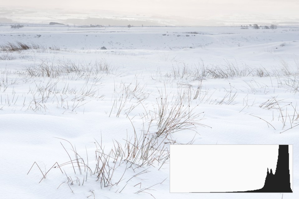
There are however, a few histogram behaviours that are a useful warning sign that something has gone wrong. A histogram is heavily skewed to the left, so that the histogram almost appears to lean agains the histogram box, is an indication that the image is likely to be underexposed. (Technically, it is showing that the blacks are ‘clipping’. This means that there is no recoverable image data there. If you lightened you photo in post-production then you would only make the black pixels a lighter grey, not recover any lost details.) The solution is to apply positive exposure compensation to lighten the image and push the histogram to the right. A histogram heavily skewed to right is an indication that the photo is overexposed and that the highlights are clipping. The solution to this problem is to apply negative exposure compensation and push the histogram to the left.